Sample templates for page layout
There are a number of ways a web page can have its information organized. Below are
some templates for the more commonly used ways of setting sites up.
Navigation in left column
(see bottom of page for more information about types of site navigation)
Template 1
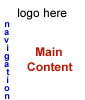
This is a very widely used page layout - logo on top, navigation in the left column, and main content in the middle.
Template 2
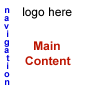
This layout is different in that instead of the logo being centered and by itself along the top of the page, the navigation starts higher up, next to the logo. This can be especially useful when there is a lot of navigation links, or when the logo is not very wide. Look at this site for an example.
Template 3
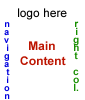
This is a variation of the first template, with a right column added. Right columns are great for miscellaneous information and links that don't fit elsewhere. Here are two examples - example 1 (the main page of this site), example 2.
Template 4
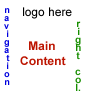
This is a variation of template 2, with a right column added. It could be placed either up next to the logo, or lower, as pictured to the left.
Navigation along the top
Template 5
In this design style, the navigation is placed directly underneath the site logo. This tends to work better when there are fewer navigation links. See this non-profit site for an example.
Template 6
This is a variation of 5, with either a left and / or a right column added.
Navigation in the middle
Template 7
In this example, an image, possibly containing the logo, would be in the middle of the page. Different parts of the image would be the links to other pages of the site. It would be highly recommended with this kind of layout style to have additional text on the page giving a basic introduction to the site. See the example in number 6 above to see a site with the navigation as part of the logo graphic. In that site the logo, navigation and other graphics were created in Flash. However, the rest of the layout style was like number 6.
Further variations of all these templates are possible. Also having the main navigation along the right column or the bottom are also possibilities. This is not done very frequently because it can make it difficult for some people to find the navigation, depending on the monitor / browser window size of the site visitor. While having a logo on top and navigation to the left may seem boring or unimaginative, there is a reason why many sites are set up this way. It is easier for people to find their way around your site when the navigation is someplace where they expect to see it.
Navigation styles
The main navigation (the links to the other pages on your site) on a web site can be made a number
of different ways. Any of the navigation types below can be used for any of the templates above (with the
exception of template 7, which is by definition not a text link).
Text Links - The most basic is when the links are all text. This may not seem very creative,
however it works very well. It helps the page to load faster, and when the site has a large number
of pages to link to, it is the most efficient way. It also makes the site faster and easier to update.
Buttons Links - Buttons are images that link to the subpages of the site. They can be simple
images or be made with mouseovers that make them look like buttons that really are being pushed in.
Graphics Links - This is really just a variation of the type above, except a larger image
is used, and clicking on different parts of the image, takes you to different parts of the site.
An example of this can be seen here.
© 2002 - 2026 Fronterix