Web Site Usability - What to Avoid
Studies have shown that the typical web surfer will decide within 4 seconds if they will stay at the site they are at, or move on. If it is difficult to figure out how to navigate through your site or to understand what the site is about, many of your site visitors will move on. This article will focus on what you should avoid on your web site. See Effective Web Site Organizationto find out how a site can be constructed so that it is well organized and easy to navigate through.
Avoid Bad Site Navigation
- Make sure that the main links through the site are clearly visible. If the links are hidden
from view for some artistic or other effect, you should have a good reason for doing so, because
you will likely lose a good number of visitors when they can't find the navigation buttons.
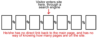
- Don't make assumptions about how visitors will use your site. Site navigation should consist
of more than forward and back arrow buttons. Many people will enter your site from a page
other than the main page because of search engine results listing these other pages. If your
site has 10 pages all of which are only linked to each other through a series of arrows and a
visitor enters your site on page 5, how do they know how to get back to the main page? They
may start clicking the back arrow, but they won't know if your site has 10 or 100 pages, or if they
are towards the end or the beginning. Most people are not likely to click the arrow more than
a few times, if they don't find what they are looking for in that amount of time they will leave.
Many people may only look at a little bit of your site now, bookmark it, and then come back later
to read more. If they left off on the 8th page of your site, they need to be able to navigate
directly to that page, and not have to click the forward arrow 8 times. Don't count on them
using the back button on their browser either, some may not even know it is there, and even if
they do they are likely to not want to click it a dozen times to get back to a previous page.
Let the Visitor Retain Control Over Their Browser
- It is not a good idea to have a site designed that will cause the browser window to automatically
open up to a size that fills the entire monitor. Most people have their browser windows open to
the size they want, and will not appreciate you forcing your preferences on them. Many people will
also be working on other applications while looking at your site, and want those windows also visible.
- The status bar at the bottom of Internet Explorer shows useful information that many people
refer to while surfing the web. If a site has other messages displayed there, it takes away
the visitors choice to see the other information about the sites they are viewing.
Use of Underlined Words
- Avoid underlining words or phrases that are not links. Since by default all text links are underlined, visitors may get confused when they see text that is underlined and assume that it is a link. They may even think that the link is broken.
Splash Screens
Splash screens are pages with very little content that may appear when you first
visit a site. They commonly contain either Flash animation or messages about what
browser is recommended to use. These are bad for a number of reasons.
- One, if they are
Flash animations they tend to take too long to load. The first time a person comes to your
site, they may be entertained by it, but if they keep coming back to your site, they will
not want to have to wait for it to load and play each time.
- Second, they are not helpful for search
engine placement, see Search Engine and Directory Optimization
for more information.
- Third, asking the site visitor to use a certain browser is likely to
either confuse someone when they don't understand how to download other browsers or versions,
or annoy them if they like the browser they are already using and don't want to change. This
doesn't mean that it is wrong to place a comment somewhere else about what browser would work best
with your site however. This information could be put in an 'About this Site' section, for example.
- Finally, splash pages create an extra layer between the site visitor and the information you
want to present to them. Why add anything to your site that gets in the way of the sale?
Background Music and Images
- Background music takes a long time to load and can even crash some people's browsers.
Also, many people listen to mp3's, radio, c.d.'s, etc. while surfing the net and would
prefer to listen to their own music choices. They may also be browsing while at work
or at a library where it would be inappropriate for them to create a lot of noise while
looking at a web site. Of course, if the site is about music or some other entertainment
it may be appropriate, but isn't for most business sites.
- Background images can be a problem if they are really large, because they take too long
to download, or if they obscure the text on the site. Use with caution.
- Too many images in general can also be a problem because of download times. Make sure
that images on your site are related to its content and have a real purpose for being there.
Frames
- Many search engines do not index pages with frames very readily. Google is one example -
see Google's Webmaster Info
pages for more information.
- Framed pages are hard to bookmark
- Printing a page with frames can be difficult
- Screen reader software for the visually impaired cannot handle frames well, neither can cell phones
- New web users sometimes get confused when one part of a page scrolls and the rest stays still
© 2002 - 2026 Fronterix